Completing a basic accessibility check
It’s important to complete a basic accessibility check of your digital product to see if it meets accessibility requirements.
Use this guide if you have limited knowledge of accessibility or web development. Please note, it does not cover all potential accessibility issues.
To help you complete a basic accessibility check, we recommend using either Google Chrome or Microsoft Edge web browsers.
You will also need to download the following extensions from the Google Chrome store:
Page Titles
A page title should describe the purpose or topic of the page.
When pages are titled correctly, it makes it easier for users navigating sitemaps or reviewing search results to find the content they are looking for. Also having the correct page titles that display in the browser tab reassures users they are on the right page.
Reviewing page titles
Check that the page title:
- describes the purpose or topic of the page
- matches the page heading (the page title should be Heading 1)
- is unique so users don’t get confused by duplicate titles
You can view the title of a page by hovering your mouse over the browser tab.
Page title examples
A good example of a page title is ‘Blue Badge – Apply for a Blue Badge - Essex County Council’
A bad example could be: -
- ‘More information’
- ‘Guidance’
The do not clearly describe the purpose or topic of the page or section.
Page title useful links
Headings
Headings and subheadings are used to separate sections of content.
It’s important that they are assigned correctly so screen readers or keyboard only users can understand them.
Reviewing headings
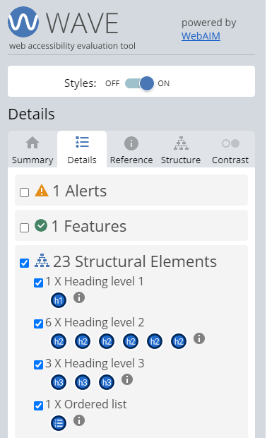
You can easily view the different levels of headings using the WAVE accessibility tool.
Check that: -
- there is at least one heading per page (Heading level 1)
- headings follow a logical order (Heading level 2, Heading level 3, Heading level 4)
- heading tags are not empty
- heading levels are not skipped
Heading examples
- H1 - Apply for a Blue Badge
- H2 - Contents
- H2 - Who can get a blue badge
- H3 - Automatically eligible
- H3 - If you’re not automatically eligible
- H3 - Non-visible (hidden) disabilities
- H3 - Applying on behalf of an organisation
- H3 - More information
- H2 - Who cannot get for a blue badge
Heading useful links
- WAI Page structure headings tutorial
- Understanding Success Criterion 1.3.1: Info and Relationships
- Understanding Success Criterion 2.4.6: Headings and Labels
Images and alternatives
If you’re adding images to a web page, they need to be accessible to everyone including those that use assistive technologies.
Alternative text (alt text) allows assistive technology to describe the image to people with visual impairments.
Reviewing alternative text
When reviewing alt text, check the purpose of the image.
If the image is to add decoration to a page, use a null value. This is done by inputting a space as the alt text for an image.
If the image adds value to the page that is not communicated in another way, the alt text must tell the user what information the image provides.
If the image is a logo the alt text should identify that and what logo it is.
Images that are links should include alt text that describes the destination of a link.
Alternative text examples

The banner image used on the Essex County Council homepage offers no relevant information to the content of the page. We give the alt text a null value (empty) to mark the image as decorative.

The Essex County Council logo is assigned the alt text ‘Essex County Council Logo’.

The Facebook logo used in the footer of websites usually points to the organisation’s Facebook page. We use the alt text to describe the link destination. In this example the alt text is ‘Essex County Council Facebook’.
Images and alternatives useful links
- Web accessibility tutorials: Images concepts
- Web AIM alternative text
- Understanding success criterion 1.1.1: Non-text Content
- Using alt attributes on img elements
Resizing text and zooming in
Some users with visual impairments use screen magnification tools that zoom into the page content or increase the size of the text. Some browsers give you the ability to zoom in or increase font size.
You should be able to zoom a web page to 400% of its normal size and increase font size to 200% both individually and simultaneously.
Most browsers allow you to zoom in by either opening the menu and selecting the plus button under the zoom funtion or by holding the ‘Ctrl’ key and scrolling the scroll wheel on your mouse.
You can also use tools like the A+ Font Size Changer to increase and decrease font size.
Reviewing resizing text and zooming in
When resizing the text, check that: -
- all text size is increased
- text is not cut off or not visible
- parts of the page do not overlap
- all controls are visible and usable
- horizontal scrolling is not required to read text
When zooming in, check that: -
- all content is increased in size
- text or content is not cut off or not visible
- parts of the page do not overlap
- all controls are visible and usable
- horizontal scrolling is not required
Resizing text and zooming in examples
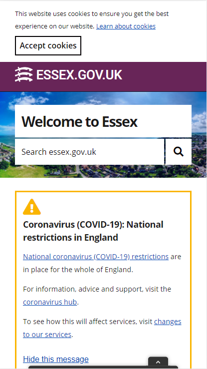
When you zoom in to 400% on a web page, the page should appear as if it was on a mobile device.
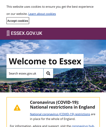
When you increase font size to 200%, you should see all text on the page increase in size.
Resizing text and zooming in useful links
Colour contrast ratio (Text)
Users with some visual impairments are unable to read text if the contrast between the text and background is too low.
You need to ensure that colours across the content all meet the minimum contrast ratio. This applies to text, buttons and navigational elements.
Review colour contrast
When reviewing page text, it must meet the minimum required contrast ratio of 4.5:1. This is done by comparing the colour of the text with the background colour.
Large text must meet the minimum contrast ratio requirement of 3:1.
There a variety of tools for analysing the contrast of colours.
The WAVE accessibility tool allows you to quickly analyse the page for text contrast that falls below the minimum ratio requirements. If text sits on top of an image, we recommend using the Accessible Color Picker to check the colour contrast.
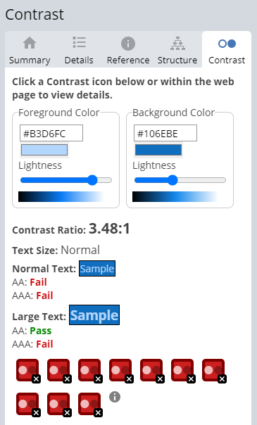
The contrast tab of the WAVE extension outlines all current contrast issues and what contrast ratio they are.
Colour pickers like the Accessible Color Picker Chrome extension allow you to pick individual colours and compare the contrast. The downside to this method is that it is time consuming.
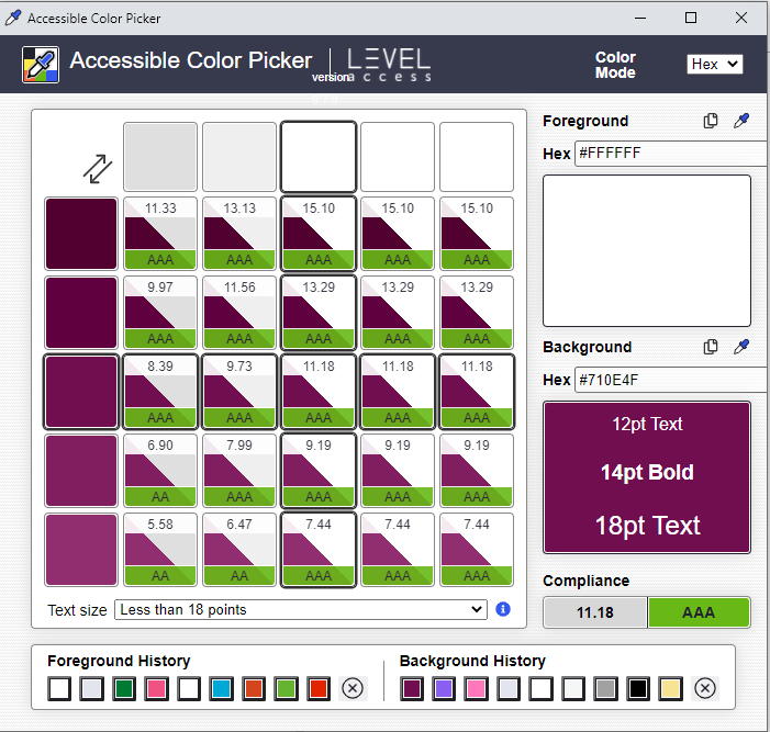
This colour picker will also offer different shades and combinations outlining which ones comply with the Web Content Accessibility Guidelines (WCAG) 2.1 AA standard.
A combination of the two methods can help to be certain that the colour contrast meets minimum requirements.
Colour contrast useful links
Links
Links help users navigate through a website. Some screen reader users will navigate a page by tabbing through the available links. The link should clearly explain where the user will be taken.
Reviewing links
Check that the link text accurately describes where the user will be taken.
A good technique is to read the link on its own without any surrounding content. If the link makes sense, it is likely it is accessible.
Link text like ‘click here’ or ‘more information’ does not meet accessibility requirements.
Link examples
Good examples include: -
- Essex County Council
- Guidance explaining what good link text looks like
Bad examples include: -
- Click here
- More information
- Find out more